Click here to see this email on the web |  | Friday, November 24th, 2023 | | Step-by-Step: How to Paint Like Van Gogh
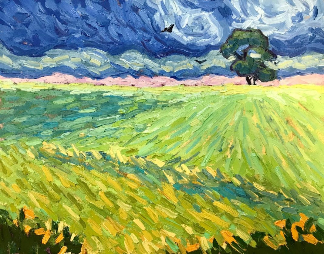
| By Dena Peterson, featured in the PaintTube.TV workshop, "Portraits Van Gogh Style" | Share this article:     | 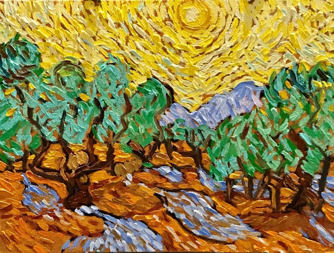 | Van Gogh–inspired painting by Dena Peterson
| From "Starry Night" to "Wheatfield with Crows", Vincent Van Gogh is one of the most recognized and beloved painters of all time, even though he only sold one painting during his lifetime. He is considered to be the father of Expressionism. He combined his love of Impressionism and Pointillism to take painting in a new direction.
My name is Dena Peterson, and I had the honor of being one of 125 international artists selected to paint in the style of Van Gogh for the Academy Award–nominated film Loving Vincent (BreakThru Films), the first hand-painted full-length animated film that explores the life and death of Van Gogh, as told through his paintings. In order to pay tribute to him and to make his paintings come to life, I had to become intimately acquainted with his work and his style. |  | "There is only one Vincent Van Gogh. But studying his work has helped me to take more risks in my own and to paint with more passion. I hope "Portraits Van Gogh Style" can inspire you to do the same." ~Dena Peterson
| How to Paint Like Van Gogh, Step by Step | 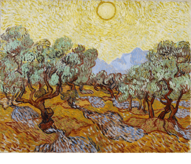 | Above, Reference photo: Vincent Van Gogh, "Olive Orchard with Mountains and Disk of the Sun," 1889, oil on canvas, 29 x 36.5 in., The Minneapolis Institute of Arts, William Hood Dunwoody Fund
| Most great artists have spent time copying the works of the great artists that came before. It's an age-old tradition that helps you to understand the artist's process. Van Gogh copied many of his favorite artists, including Rembrandt, Delacroix, and Millet, as well as the Japanese prints of which he was so fond.
For the film Loving Vincent, I was tasked with copying Van Gogh's paintings and his style. It really gave me a better idea as to how he worked. I became like a detective, studying his brushwork and overall design. What size brushes did he use? How did he apply his paint? Did he cover the entire canvas, or let some canvas peek through? What colors did he use?
This taught me so much about Van Gogh. So, I have developed some steps that I teach in my workshops, "Channeling Van Gogh: How to Add Passion to your Paintings" that I thought might be helpful. Whether you are simply curious about his approach, are a fan of his work and style, or are trying to find your own artistic voice, this can be a useful tool for you!
Related > Loving Vincent: 10 Things I Learned From Van Gogh
| — advertisement — |  | Below are some of the steps to help you get started in learning how to paint like Van Gogh:
1. Tone your canvas with an overall color that you see in the work. You can use acrylic paint thinned with water and let it dry, or you can use a thinned oil paint. Here, I used yellow ochre acrylic paint and let it dry completely. Remember the "fat over lean" rule for longevity and for the paint to adhere properly. "Fat" = more oil/binder. "Lean"=less paint, thinned with mineral spirits. You can paint oils on top of acrylics, but not the other way around. When Van Gogh painted, acrylics had not yet been invented. Oil brushwork will tend to hold its "impasto" shape better than acrylic. |  | 2. Divide your reference photo and your canvas into a grid, dividing each side into even thirds. Don't use a ruler — there is no need for perfection here! I used a dry erase marker on a transparent sheet cover to preserve the photo. Then it can be wiped off later. Use a thinned darker mixture of burnt sienna and ultramarine blue to draw your grid on your canvas. These lines will later be painted over. This is optional, but it will help you transfer and place your large shapes onto the canvas. Van Gogh built and used a viewfinder to help him transfer his view onto his canvas in a similar way.
|  | 3. Use the same thinned mixture to draw the largest shapes onto your canvas. Use a smaller brush; I like a size 2 natural bristle hair filbert. If you make mistakes, you can easily wipe this off with a paper towel or rag soaked with some mineral spirits. Study the lines in each grid on your reference photo and transfer those proportions onto your canvas. Again, focus on the placement of the largest and most important shapes. Avoid any detail and don't worry about perfection in drawing and placement. You will adjust this as you paint. For now, it is more about getting the overall shape relationships correct on your canvas. |  | 4. Begin to study the main colors in the photo. There is no true formula for mixing these colors; there are many ways to come up with similar colors. Just do your best to find a close match. This will help your color-mixing skills and skills of observation. I don't like formulas for colors; every paint manufacturer's colors have different qualities.
Related > Color Mixing for Beginners
Once you think you have something close, you won't know if it's right until you have it on your canvas and can relate it to the color and value next to it. When you think it's right, go ahead and mix a large pile of this color. You may need to modify it as you paint, but having enough color mixed will help you to paint with more spontaneity. It helps to find your darkest colors (tree branches and trunks) and then your lightest colors (sky) and compare the rest to these. Having these extremes will help you judge your value range.
For example, you can compare your sky to your distant mountains, the mountains to the trees, the tree trunks to the ground, and so on. Notice that the sky is not just one color, but broken colors of similar values. Van Gogh learned this from studying impressionism and, especially, pointillism. This adds to the vibrancy of his works. The same is true for the rest of his painting. Study carefully to notice and copy this effect. You may also notice that the "shadows" cast by the trees are not the correct value. Van Gogh was not really interested in painting light and shadow; he was more interested in painting color, pattern, and form. And he once said that he didn't paint what he saw; he painted what he felt. |  | Dena Peterson, "Woman with Red Roses," oil on canvas, 14 x 11 in.
| Preview the 3½ hour art video workshop "Portraits Van Gogh Style" here
|  | Here are some color combinations that I chose to help you get started:
|  | Brushwork and Paint Application
Notice that Van Gogh's brushwork tends to follow the form of what he was painting. Think of how the sunlight radiates, how the ground undulates, how the foliage grows, etc. He painted with thick and very deliberate strokes of paint.
Study the size of the brushstroke. Because we are working smaller, you may want to try a size 3 or 4 filbert. A stiffer bristle brush works best for this technique; a soft brush will not give you the impasto brushwork. Go ahead and experiment with different sizes and shapes of brushes to get the right effect. Pick up generous amounts of paint with your brush.
Some additional tips:
• Practice laying the brush on your canvas with a light touch (maybe rolling your brush) and then leaving it alone.
• Avoid rubbing the paint into the canvas or moving the brush too much as you place the paint.
• Pick up more paint and put another brushstroke like this next to it, changing colors as needed.
• If you are changing colors, you should wipe off the other color with a paper towel. There is no need to constantly wash your brush in mineral spirits. This often just thins the paint too much.
|  | Dena Peterson, "Storm Over the Prairie," oil on canvas, 9 x 12 in.
| Again, study the way Van Gogh applied his brushstrokes. Sometimes, he mixed his paint together on his canvas a bit as strokes are laid next to one another. But don't overdo this. He did not purposely "blend" his colors into each other very much.
Often, I will use one brush for my darker values/colors, and another for my lighter values/colors to keep them cleaner. Van Gogh didn't use medium in his paints, as it would tend to decrease the impasto qualities. He liked a "matte" quality to his work and he would actually lay the paint out on towels in order to absorb some of the oil out of his paints.
I sometimes like to use Res n Gel by Weber or Gamblin's Galkyd Gel to make the paint go further while still maintaining its thickness. It does, however, increase the transparency of the paint. |  |
|
|
|
Don't be afraid to adjust your shapes as you paint. You should be covering up your original drawing. Vincent often "re-stated" his drawing and emphasized it with dark outlines. His individual strokes may seem fairly straight, but as they create form and pattern, they also create movement. The process is one of building up paint and brushwork. It takes time and you must be patient. Keep going until you have filled your canvas, and note that it's okay to have some of the original toned canvas showing through between your strokes of paint; this was something Vincent did quite often.
Try these techniques in your own work using your own subject matter. You may find that you enjoy painting with more deliberate, impasto brushwork and vivid color. You can be inspired by Van Gogh and paint with more passion, yet still make it your own, unique work in your own voice. That is the true lesson we can learn from Vincent.
| — advertisement — |  | Kelly Kane's Pick of the Week: Scipio Morning |  | Greg Barnes, "Scipio Morning," 2011, pastel, 11 x 14 in., Private collection, Plein air
| In this weekly series Kelly Kane, Editor-in-Chief of PleinAir® Magazine, shares a favorite painting from a previous issue.
"I don't change the color, I just push it. I push it a little bit beyond what is there. If I am looking at a gray house or sky, I first look for the temperature — is it warm or cool? Then I pick up the closest color that I see and start with that. As a result, my paintings have more expressive and vibrant color. I tend to see a lot of color in a scene, a skill gained from observation over time."
— Greg Barnes ("Seeking Contrast," December-January 2019, PleinAir Magazine)
| — advertisement — |  | — advertisement — |  |
|
| | |
|
Plein Air Today is committed to protecting and respecting your privacy. We do not rent or share your email address. By submitting your email address, you consent to Streamline Publishing delivering regular email issues and advertisements. To end your Plein Air Today e-mail subscription and associated external offers, unsubscribe here. To learn more about Streamline Publishing events, products, and offerings visit StreamlinePublishing.com
Copyright 2023 Streamline Publishing, Inc. All rights reserved.
PleinAir® Magazine and Plein Air Today® are registered trademarks of Streamline Publishing, Inc. |
|
|
|
|


Comments
Post a Comment